2025
College of Nursing Science Muslim Medical Foundation, Saki, Nigeria
https://www.consmmefs.edu.ng/
Redesigning for Real Impact
The College of Nursing Sciences, Muslim Medical Foundation, Saki, needed a complete redesign of their student and administrative portals. The existing system was outdated and lacked the efficiency required to handle the admission process smoothly for both fresh applicants and school administrators. The goal was to create an intuitive, streamlined platform for new students to apply and track their progress, as well as a user-friendly backend for administrators to manage applications and make decisions efficiently.
Challenges We Aimed to Fix
The previous student and administrative portals were making the admission process more complicated than it needed to be. Students faced a frustrating experience with an outdated interface that didn’t provide clear navigation or an easy way to track their application progress which created confusion and delayed the application process for many applicants. On the administrative side, the school struggled with an inefficient system for managing applications. The backend lacked structure, making it time-consuming for staff to process applications and track individual applicant statuses. There was a clear need for a more modern, efficient platform that would streamline the admission flow for both students and administrators.
My Design Thinking in Action
As the lead designer on this project, my role was to completely overhaul both the student-facing and administrative portals. This involved analyzing the needs of both user groups (fresh applicants and school administrators) and creating a system that would improve their overall experience. I collaborated closely with the school’s administration to ensure the new design aligned with their vision and institutional goals.
Understanding User Needs
I began by conducting research to understand the pain points of both students and administrators. For students, the key pain points were the outdated interface, lack of clear instructions, and the difficulty of tracking application progress. For administrators, the challenge was managing large volumes of applications efficiently and tracking each applicant’s status in an organized manner.
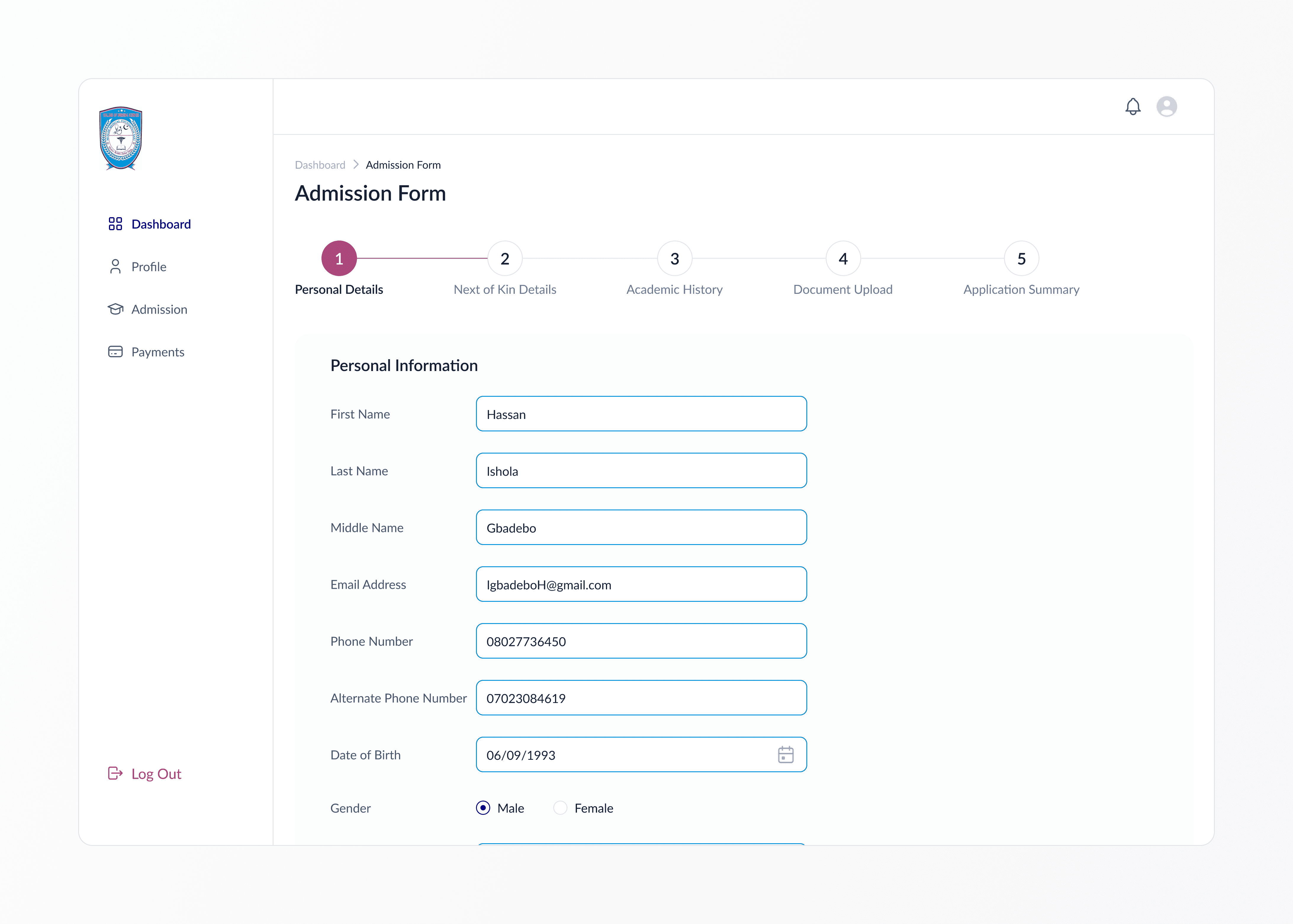
Designing the Admission Flow
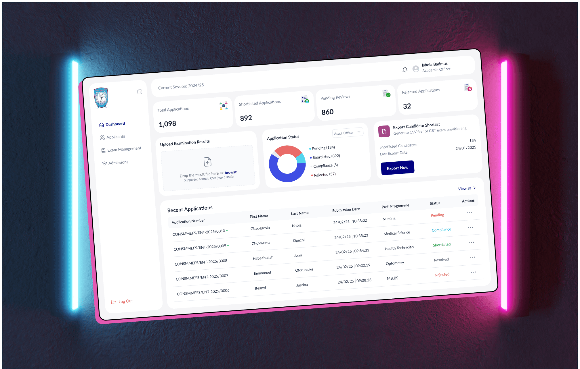
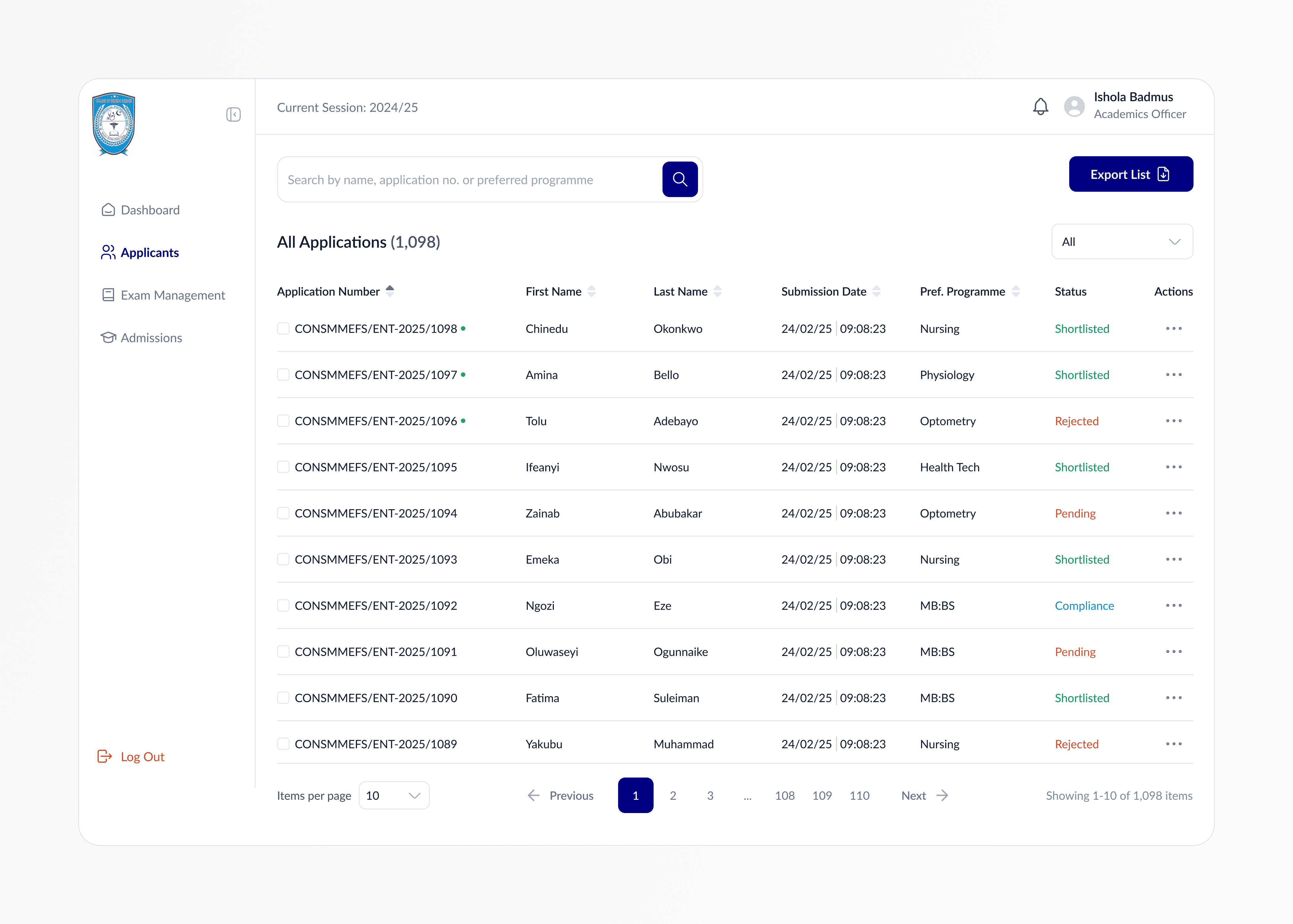
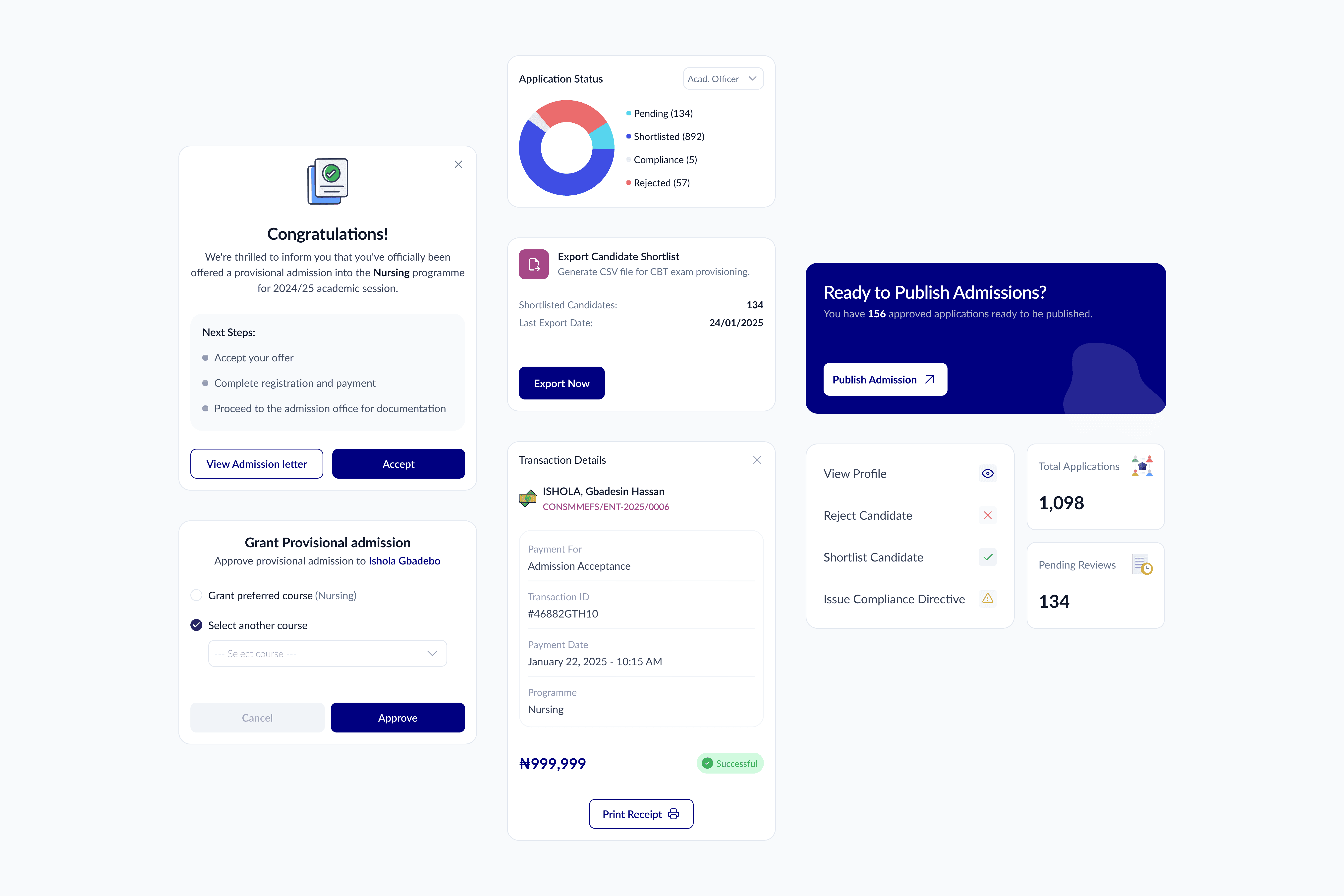
With a clear understanding of the challenges, I mapped out the entire student admission process, focusing on simplifying the steps involved. The aim was to create a clear, easy-to-follow flow for students from the moment they accessed the portal to the final submission. For administrators, I designed a streamlined interface where they could easily review and manage applications, track progress, and communicate with applicants if needed. The redesign process focused on creating an intuitive, modern portal that met the needs of both students and administrators, improving usability and efficiency across the board.
Admin Experience Optimization: A comprehensive dashboard was created for administrators to view, manage, and update applications efficiently, with features like status filtering and quick access to applicant profiles.
End-to-End Admission Flow: I mapped and redesigned the entire admission process, enabling applicants to register, submit documents, and track progress through a structured and intuitive interface.
Responsive Design: The portals were designed with a mobile-first approach, ensuring accessibility and usability across all screen size.
Visual Clarity: Clean layouts and clear visual hierarchy were applied to simplify the interface, making information easy to navigate and act upon for both user groups.
User-Centered Flow: Every interaction was tailored to reduce friction from onboarding to final submission ensuring a smooth, frustration-free experience for students and admin users alike.
What I Learned
This project deepened my understanding of designing for dual-user systems where both student applicants and administrative staff rely on the same platform in very different ways. I learned the importance of mapping out each user’s journey separately while ensuring both experiences remain connected and cohesive. It also reinforced how vital clarity and accessibility are in high-stakes processes like school admissions. Every interaction had to feel intuitive and supportive, especially for users who might not be tech-savvy. Lastly, collaborating with a non-technical team reminded me of the value of clear communication when aligning design decisions with organizational goals.